Google Drive Link
Saturday, April 14, 2018


Double Page Spread: FINAL
After changing my idea to a more simplistic layout then what I originally had in mind, I was able to complete my double page spread with no problem. I am glad that I decided to switch my idea because I feel like a more simplistic design helps keep the reader's attention on the article entirely. I had some issues with finding a font that I liked, but I ended using a classic, Times New Roman. This font is super sleek and simple, exactly what I was going for. The only issue that I had with my double page spread is deciding on what picture I wanted to use. I originally took around eight photos for my double page spread and after editing/looking at them again I was able to narrow it down to three pictures.


I really liked the photos with the fake flowers because it tied in with my cover page, but I also liked the simplicity of the aerial shot of the makeup palette. After a few minutes of still deciding I came to the conclusion that I should pick the third photo because my double page spread is already going to be simplistic, with a black and white design. After deciding on what photo I wanted to use, I edited it for my double page spread.

I brightened up the photo, which gave it a much sleeker and clean look which matched my spread perfectly. After editing my photo, I started to design my spread around it, pulling colors from this photo to be used in the spread, and this is how it turned out:

I made the title to my double page spread very similar to my masthead because I wanted my magazine to be cohesive (also why I chose the picture with the flowers). I'm really happy with how my double page spread came out, especially after I ended up changing my layout pretty last minute.
Friday, April 13, 2018
Table of Contents: FINAL
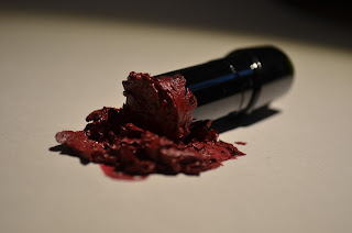
My table of contents is finally done after a ton of changes and redo's to this project. All of my pictures came out good, and I was super happy with the way they turned out after I finished editing them on Adobe Lightroom. Here are some of the edited photos:


My favorite picture is the one with the smashed lipstick because I feel like I was able to capture the detail perfectly and it is lit really well. As I said a few blogposts ago, I knew what kind of layout I wanted for my table of contents, having found an inspiration on Pinterest. I started to edit my table of contents, and the more I continued to edit, the more I hated the way my table of contents was turning out. It was so bland and boring that I couldn't bring myself to edit it anymore because I hated it so much. I completely scrapped my original layout, and went on Pinterest again to find some inspiration pictures. I was looking for a table of contents that integrated a lot of pictures, I wanted to make sure all the photos that I took for my table of contents were utilized. I finally found a table of contents inspiration and I really like it.

This is where I took my inspiration from, and I liked it so much better than my previous layout. I was able to use most of my pictures from my photo shoot which I was super happy about because I am extremely proud of how they came out. After a few hours of putting together my new table of contents I got here:


My favorite picture is the one with the smashed lipstick because I feel like I was able to capture the detail perfectly and it is lit really well. As I said a few blogposts ago, I knew what kind of layout I wanted for my table of contents, having found an inspiration on Pinterest. I started to edit my table of contents, and the more I continued to edit, the more I hated the way my table of contents was turning out. It was so bland and boring that I couldn't bring myself to edit it anymore because I hated it so much. I completely scrapped my original layout, and went on Pinterest again to find some inspiration pictures. I was looking for a table of contents that integrated a lot of pictures, I wanted to make sure all the photos that I took for my table of contents were utilized. I finally found a table of contents inspiration and I really like it.


This is my final table of contents and I am pretty happy with how it turned out in the end. For each different featured story, I made the page number and title bolder if they held importance (my main cover line is the biggest/boldest one, my other sell lines are bolder and bigger than the other featured stories). I love the detail on all of my photos, and how my table of contents is simple, but definitely is a blast of color.
Saturday, April 7, 2018
Cover Page: FINAL
I have been working on my cover page all week and I think I'm finally finished/happy with how it turned out! My cover page has definitely evolved since I started editing it. I started with editing the few photo choices I had on Adobe Lightroom, using the preset I made for my photos. Editing the photos made a HUGE difference, I was worried that I would have to do another photo shoot for my cover page but my pictures turned out better than I expected!! This was the before and this was the after:


I love how my cover page turned out, it looks exactly like I had originally envisioned it. After spending some time editing my cover page photo I was finally able to move onto actually editing it to look like a magazine cover. I used Adobe Photoshop to edit this photo into my magazine cover and was super happy with the results. My cover page started out super plain, and I didn't even put my cover line because I didn't really like how crowded the text looked on the page but then I started to play around with the text, I even looked on Pinterest for some ideas. This was my first cover page:

Then I looked Pinterest and found this:

I really liked this cover, so I tried using similar techniques for my cover page and this is how it turned out:

I was super happy with this cover and I thought for sure that this one would be it, but I talked to a few people and realized the circle on the bottom made my magazine look like a magazine you would see in line at the grocery story and I totally agreed. I want my magazine to be an upscale beauty magazine that is found at the bookstore, so that was definitely not what I was going for. I then changed my cover to this:

I completely scrapped the whole exclusive makeup thing on the side, I also bolded and changed the color of my main cover line. I really liked this cover, but wasn't too happy with it because the main cover line was still pretty hard to read. One of the people I talked to told me to darken the area the text is lying on top of, so I tried it and it worked out better than I thought it would. This is my official cover:

I really like how this cover turned out and I love seeing how it evolved from when I started to where it is now. My next step is my table of contents so I need to edit those photos so I can start editing them together, using Adobe Photoshop once again.
Thursday, April 5, 2018
My Double Page Spread Article/Photo Shoot
During my photo shoot for my table of contents, I also took photos for my double page spread. My double page spread is an add on to my cover page, and my main cover line so I wanted these photos to be cohesive with the cover page photo and my article. As I was taking photos, my idea for my double page spread layout changed, and I now want to go with a much simpler idea with fewer photos. I'm taking inspiration from this picture that i found on Pinterest.

I like how the whole page on the left is just a photo, so I'm thinking the same for my double page spread. I'm imagining my double page spread to be simplistic, being all white and simple black font so the colors in my photo will standout against the rest of the spread. I want the reader's eye to be attracted to the picture so that's the first thing they see as a representation of what the article is about. I am still considering adding other small photos on the page with the text, but I don't think I'll make that decision until I start editing my pages together. These are some of the photos that I took for my double page spread:


I'm leaning toward one of the pictures at the top since they have the fake flowers like the cover does, so they tie in together. I'll have to edit these photos to get rid of the yellow tint from the artificial light I used, so hopefully that will make my decision easier when choosing which photo I should use for my double page spread.


I'm leaning toward one of the pictures at the top since they have the fake flowers like the cover does, so they tie in together. I'll have to edit these photos to get rid of the yellow tint from the artificial light I used, so hopefully that will make my decision easier when choosing which photo I should use for my double page spread.
Tuesday, April 3, 2018
My Table of Contents
For my table of contents, I took inspiration from a magazine spread from Pinterest, as mentioned in a previous blog post.

I used my white poster board to serve as a backdrop for my photos, so if I needed to I could cut out the background if I needed/wanted to. I took a pictures of different makeup products, playing with angles and placement. While I was doing the photo shoot, the sun was setting so I was losing natural light, so instead I used artificial light. I was super worried about this idea since in earlier posts I decided on just natural light for my photos, but since I was losing daylight I went just went with it.


The first picture is when I just used the natural light that was slowly going away, the second picture is when I used natural light with the artificial (I used a lamp on the left side to get a more pronounced shadow). I'm very happy with how these look, but they will need a little bit of editing so they can look brighter and less yellow. Here are some more shots I got for my table of contents:


I used my white poster board to serve as a backdrop for my photos, so if I needed to I could cut out the background if I needed/wanted to. I took a pictures of different makeup products, playing with angles and placement. While I was doing the photo shoot, the sun was setting so I was losing natural light, so instead I used artificial light. I was super worried about this idea since in earlier posts I decided on just natural light for my photos, but since I was losing daylight I went just went with it.


I really love how all of these turned out, now I just have to edit them to get the look I want for my table of contents!
Subscribe to:
Posts (Atom)
-
 For my table of contents, I took inspiration from a magazine spread from Pinterest , as mentioned in a previous blog post. ...
 -
It's finally done!! It has been a crazy seven weeks, hope you enjoy! Google Drive Link
-
 After changing my idea to a more simplistic layout then what I originally had in mind, I was able to complete my double page spread with no ...
